Bastiduo
Digital marketing agency specialized in launches, content, and social media strategy, Bastiduo wanted to relaunch itself in the market with a new visual identity that would reflect the company’s new phase.
The name, already chosen by the founders, is a play on the Portuguese words "bastidores" (behind the scenes) and duo, referencing how the company started with two friends but has since grown into a larger team.
Year: 2025
Key words: Branding • Visual Identity

Concept
From the conversations with the founders, a few key ideas quickly became clear, especially the strong synergy between them. The logo needed to translate this relationship in an elegant way without feeling obvious: the brief called for something playful, with a distinctive lettering style and the presence of brown in the color palette.
To reinforce the idea of behind the scenes, it became clear early on that the visual symbol should exist within some kind of structure, evoking the space where things happen before reaching the public.


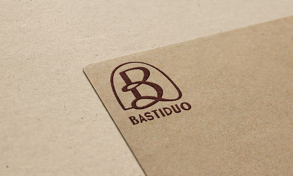


Organic yet classic monogram subtly referencing the number two. Alternating line weights create a sense of movement, balancing geometric precision with organic flow.
The rounded frame alludes to the idea of behind the scenes, symbolizing the structure and support the agency provides to its clients. The symbol can also function as a shorthand version of the brand.
The logo was designed with multiple lockups, allowing different signatures for a variety of materials and applications. The custom lettering reinforces the idea of duality: like the monogram, it combines varying line weights with both curved and geometric forms.