Carine Cezere
Specializing in enhancing natural beauty and holding international certifications in the field, Carine primarily serves women who seek to boost their self-esteem and strengthen self-love through aesthetic treatments.
Developed with the goal of positioning the brand distinctly within the aesthetics market, which is often marked by rigid visual identities that fail to convey the most important value of aesthetic procedures: the naturalness of the results. The project aimed to visually translate this purpose by creating a brand universe that feels lighter, more sensitive, and more human, reflecting not only the procedure itself, but also the positive impact it has on the everyday lives of those who experience it.
Year: 2020
Key words: Branding • Visual Identity
“How can advanced aesthetics be associated with nature?”
This was the first question I asked myself to begin the branding process. Natural means spontaneous. It does not seek artificiality. Advanced aesthetics should aim to restore this sense of naturalness so that people can experience genuine happiness with their own bodies. It is a search for a kind of natural beauty that makes sense for each client, allowing them to feel more comfortable within themselves.
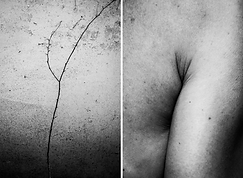
I came across the work of the photographer Alicja Brodowicz, and from that point the entire concept began to emerge.


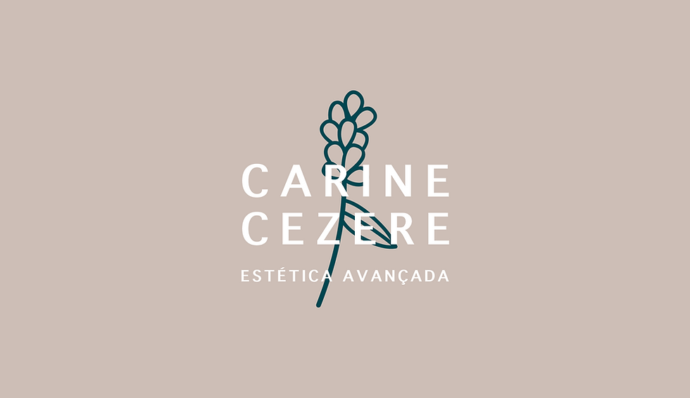
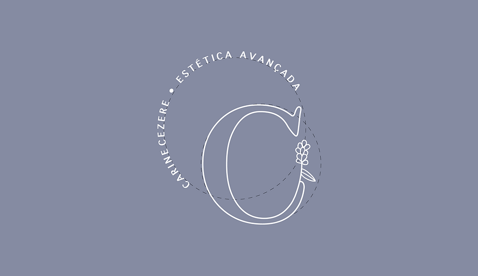
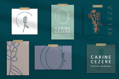
The logo is based on an intervention in the letter C, creating a proprietary monogram that reinforces the brand’s uniqueness. The palette, predominantly olive and lavender, builds a calm, deep, and welcoming atmosphere.
The visual identity evokes serenity and comfort, orbiting natural references such as air and water, along with sensory elements associated with lavender, rosemary, and daisy.
The primary logo is presented in a horizontal version, but the visual system allows different compositions using the same elements, expanding the range of applications. A bronze finish was suggested, along with an illustrated bouquet combining the lavender from the symbol with rosemary and daisies, reinforcing the brand’s sensory dimension.